MARBLING INKS

I really like the tie-dye that I was inspired by on my moodboard so I wanted to explore different types of dyeing to see what kind of outcomes I could get. With marbling I was able to get very expected results as I was able to create the pattern with the inks on top of the water so I knew what I was getting before I applied it to the fabric. Whereas the results with tie dye are more unexpected and very diverse.

PLEATS AND DYEING

In order to take my fabric dyeing to the next level I tried applying it to pleated material and other materials to obscure the pattern in different ways. I feel as though this worked well in some cases. My favourite is green pleats in the bottom left; I like the subtlety of the pattern and the contrast of the pastel red and yellow that run across.

PLEATS

To make the pleated top I had to first create them on a large rectangular piece of fabric. They had to be measured out to make sure they were perfectly in-line with one another, 1cm apart. Using the markings I ironed out each pleat to set them in place. This was a really lengthy process and took hours to complete. This is important to rethink when it comes to mass producing/manufacturing as it would put my costs right up and become really expensive for consumers to buy.

MUSE

BLOG

I’ve decided to base my muse around the iconic ‘Twiggy’. She fits in well with my retro theme perfectly because these photos were taken around this period in time. But I find her hair to be almost futuristic because it’s very minimal and quite slick. I wanted her to be quite unique without distracting from my bright clothing. My target audience is a girl between the ages 15-25; who is also adventurous or sporty.

MUSEUM

I went to Ferens Art Gallery in Hull to get some inspiration for outfits. I unfortunately didn’t find anything from the 1970s/80s but I did get inspired by a lot of the colour that was used in various paintings which gave me a better idea of what works well together and what doesn’t. I liked the abstract paintings as they reminded me of what I can achieve if I experiment with fabric dyes and similar things.

1970s

These photographs of 1970s crockery and a candle from my grandmas house are a perfect example of shapes and patterns used at this time. It was beneficial for me to see these things in real life because I got to feel them and look at them from all angles. I really like the shape of the small tea mug, is got a funky handle and the use of circles is really apparent. The colours are also important to take note of as there’s a lot of browns, burnt orange and a rich red. Even though I don’t plan on using these particular shades of colour, it’s still useful to take note of and apply elements of these ideas to my designs. The candle reminds me of lines and shapes used in pleated skirts. Lines are also apparent on the bowl, I really want to use this in my designs.

1970S LAMPS

99142026_561335637781715_4560030025851600896_n

As I am looking at 1970s furniture as inspiration for my designs, these lamps that I found at my grandmas house are perfectly suited to the brief. I love the funky and unusual shapes used in these lamps.

PAINTING FABRICS

I loved using the fabric paints on paper to then heat-press and transfer it onto fabrics. It was such a simple process but the results were really interesting. I came back to do this on Friday as I enjoyed it so much. As the day went on I got better and only wished I had more time. I tried layering the designs as you can use the same piece of paper in the heat-press more than once. Synthetic fabric seemed to work a lot better than the cottons and also produced much more vibrant colours. It was difficult to know what your outcome was going to look like as the colours looked completely different on the paper. I tried to merge the colours to give more of a fade but they dried so quickly that it was hard to do. I plan to take this technique into third year when I improve my technique and learn what works well and what doesn’t. The orange circles worked quite well and if I had more time I would probably experiment with this design using screenprint to get perfect shapes.

Looking back, I feel as though this experimentation was quite restricting as I want to create something a bit more abstract and free. I feel like dyeing may be a good route to go down or tie-dye if I want to create more of a pattern.
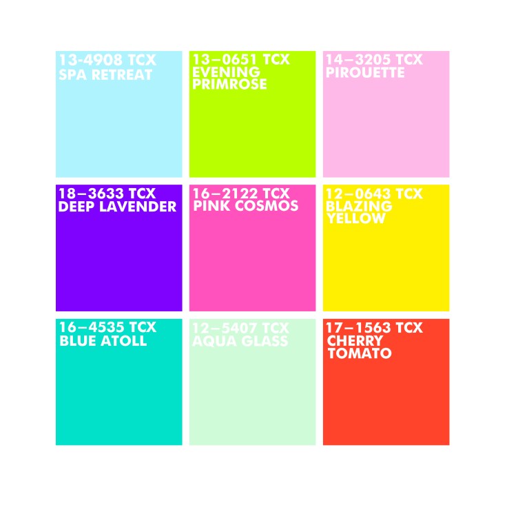
COLOUR MOODBOARD

96526940_954249405032822_152207739685175296_n

I used my findings from WGSN as a starting point and made a colour moodboard out of images I collected from various magazines. Originally, I stuck to very basic colours but then realised I struggled coming up with outfits that didn’t clash. So I created a moodboard based solely on colour to get some more inspiration. There are so many variations of different colours on here that I love; darker blues to pastel blue and lilac, pale pink to bright orange and rich red and yellow with a mix of mint and turquoise. I think the mix of lighter and bolder colours works really well. I used lots of little fabric samples that I tie-dyed, this was a good way to include multiple colours and tie everything in. I can now create a new moodboard that is more inclusive of all these colours.

Blog at WordPress.com.

Up ↑

Design a site like this with WordPress.com
Get started