GRADUATE FASHION WEEK


Today I went on a trip with my university to Graduate Fashion Week. It was great to see what other students had achieved and all the unique ideas they had come up with. I could see that so much hard work had gone into their portfolios and their work gave me a better idea of what to expect in my third year. I even got to chat with a couple of graduates about their time at university and even some advice about what I can expect over the next two years. So it was a very useful trip and I feel that I learnt a lot.
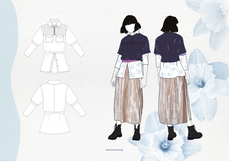
FINAL PIECE
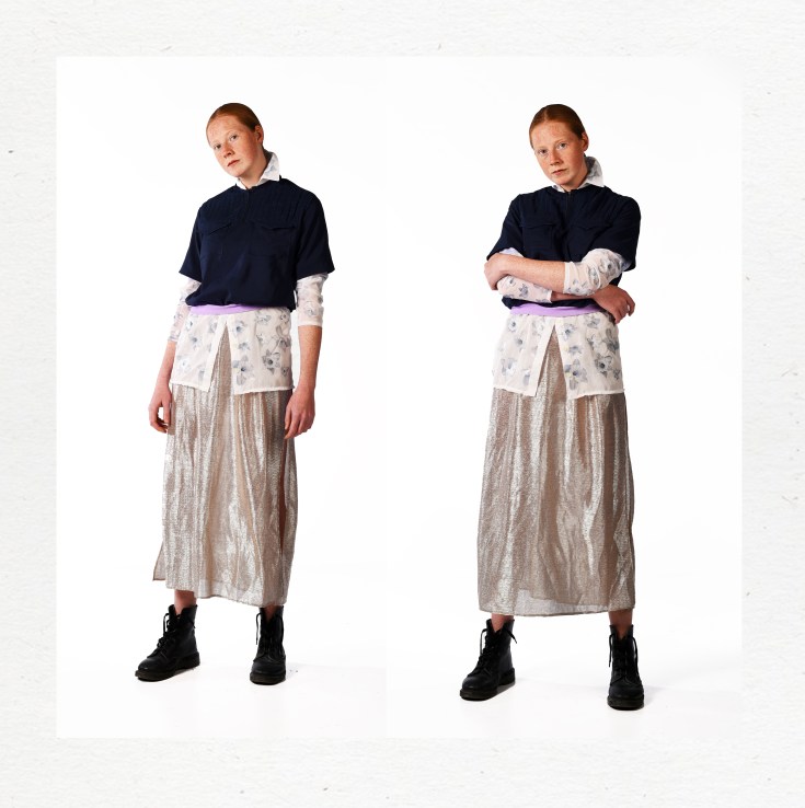 I am very happy with how my shirt turned out.
FINAL LINE UP
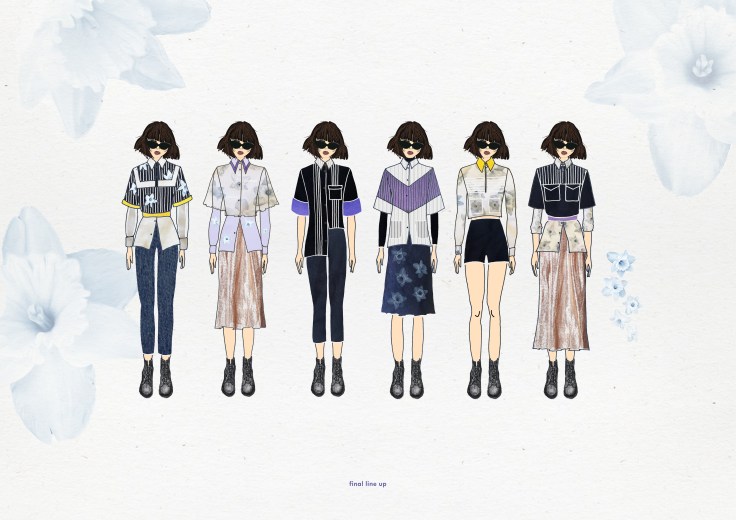
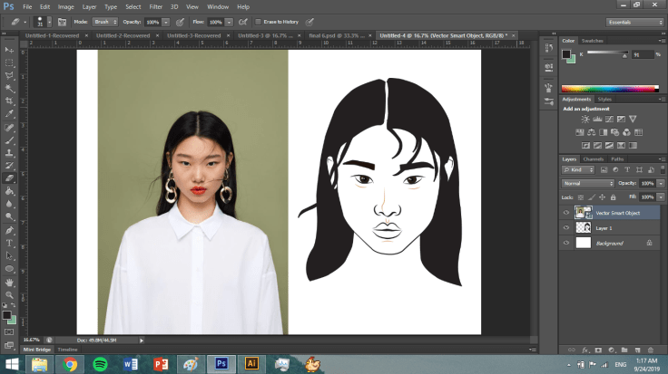
I used the face of my muse to create a head for all my designs. I thought this would fit in perfectly as she’s my target market and the type of person who would be wearing these clothes. In the designs I played around with the flowers I had already decided on; making them darker to blend in with the fabric and altering the size and placement. I wanted the flowers to look delicate and not too bold. I also used pin-tucks/stripes in a lot of the designs as this is something I took from my nurse moodboard. Also sticking to the nurse brief I also kept with the main blue colours, adding small random splashes of colour to brighten it up. Flowing and see-through fabrics are common in clothing by the Kooples so I incorporated this in many designs as well.
MOODBOARD


Here are the two moodboards I created for my portfolio. These two pages show the secondary research I gathered based around my brief. On the first page I have included a little booklet on the importance of sustainability, some images of flowers/floral prints, clothing by the Kooples and my muse. On the second page I included the second part to my brief; 1950s nurses’ uniforms. I put a lot of similar images on this page but they all said something different. I only gathered photos taken from this time of nurses at work and doing their jobs as it made it more authentic and trustworthy. I had noticed the pin-tucks in a couple of the photos and really liked them. Therefore, I went on to create some samples of different ways I could portray these lines/pin-tucks and how I could adapt them.
PHOTOSHOOT
 Today I got to see my shirt on a model for the first time. It was exciting to get an insight into the photo shoot taking place and what goes on behind the scenes.
CLOSE UPS


I took some close up photographs of my shirt in progress because I was really proud of the way the details turned out. The thread on the pin-tucks is in contrast to the fabric to make them stand out more. On the main part of the pocket I used thread that matched the dark blue material but used bright blue on the pocket flaps to make them more evident.
APPLYING THE PRINT


When printing the flowers out on the special paper I squeezed as many on a page as possible so there was minimal waste. I cut out all of the flowers by hand and then placed them on the ready cut pattern pieces in preparation of ironing them on.
THE COLLAR
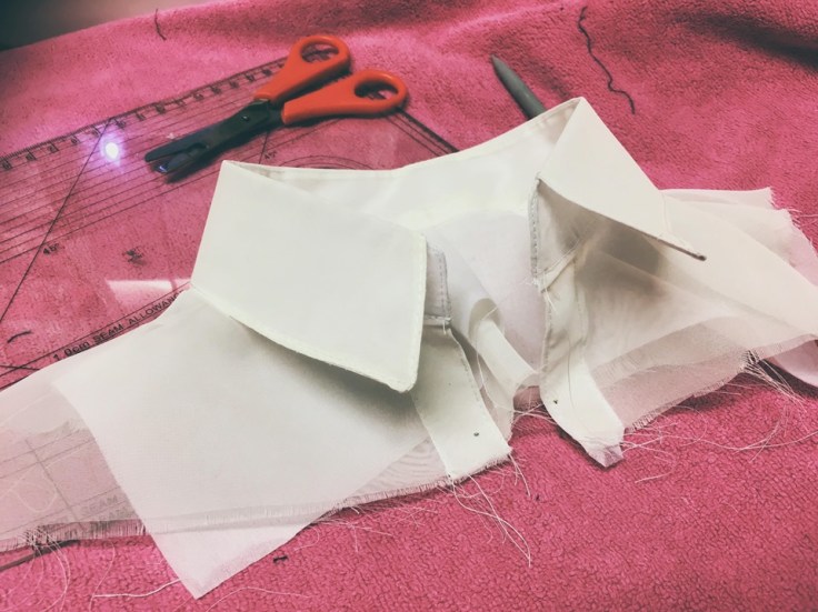 I created the collar and part of the top of the shirt to give the illusion there was a shirt underneath the t-shirt. I felt this would give a better impression that they were in fact separate.
