

When printing the flowers out on the special paper I squeezed as many on a page as possible so there was minimal waste. I cut out all of the flowers by hand and then placed them on the ready cut pattern pieces in preparation of ironing them on.
BA Hons Fashion Design (Year 3)
When printing the flowers out on the special paper I squeezed as many on a page as possible so there was minimal waste. I cut out all of the flowers by hand and then placed them on the ready cut pattern pieces in preparation of ironing them on.
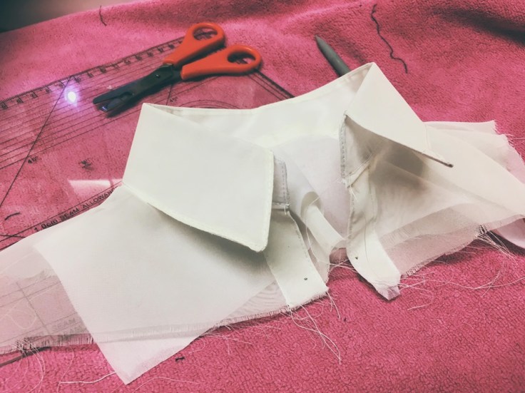 I created the collar and part of the top of the shirt to give the illusion there was a shirt underneath the t-shirt. I felt this would give a better impression that they were in fact separate.
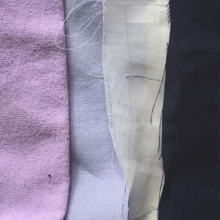 All my fabrics were sourced from second hand shops or old materials that I found in my house. I chose to stick with natural fabrics where possible as I felt this was more sustainable. I believe the colours compliment each other well and fit in perfectly with my brief.
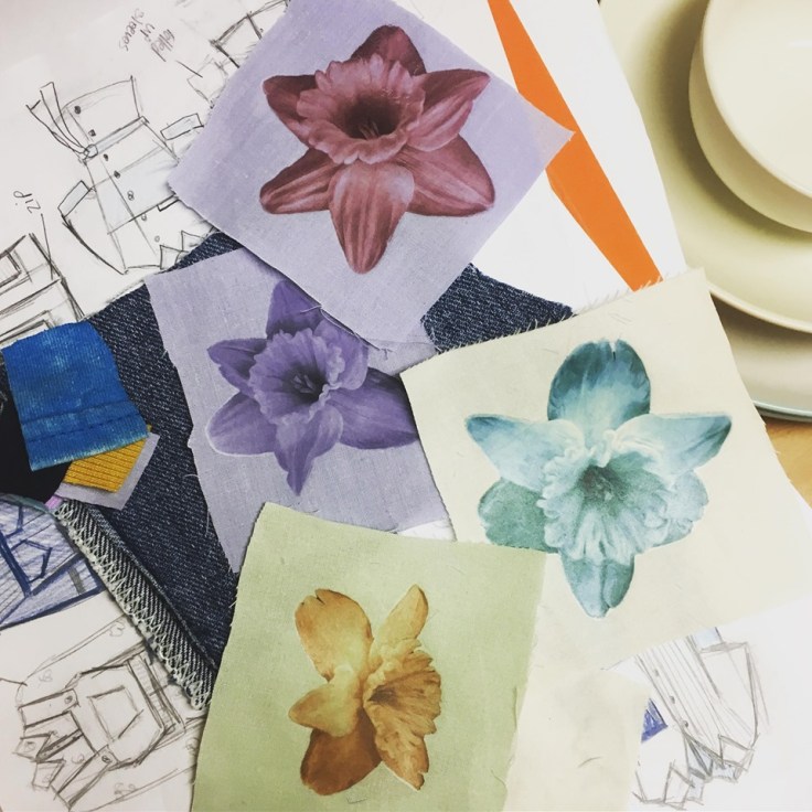 I messed around with combing different coloured fabrics with different coloured flowers. I believe the blue flower works best on the blue fabric. This fits in best with my nurse theme as well because all of the nurses uniforms I found are either blue or white.


I created my toile out of calico to see how it would turn out. I had to create all of the pattern pieces first using different parts of a shirt pattern. The upper half of the front was a little more complicated as I had to create the pin-tucks first and then cut out the shape. I had to ensure there was equal spacing between the pin-tucks so it looked professional. I was then able to measure how much fabric I needed before adding the pin-tucks so I don’t waste anything when it comes to the real material. The toile helped me work out what sleeve length would be most suitable and also how the big the pockets should be.
Brand research
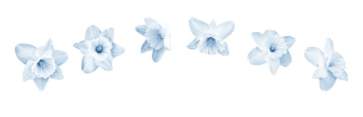
These are the 6 final flowers that I will be placing on my shirt. I decided on a very light blue because I wanted them to look more delicate on the fabric.


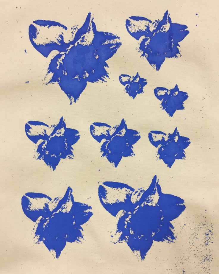
From the floral print I have been developing here is the outcome:
The yellow didn’t work as well as the blue as it wasn’t as clear or bold on the lighter fabric. Maybe if I had done a different combination of colours the yellow could’ve looked better; on a darker fabric for example.
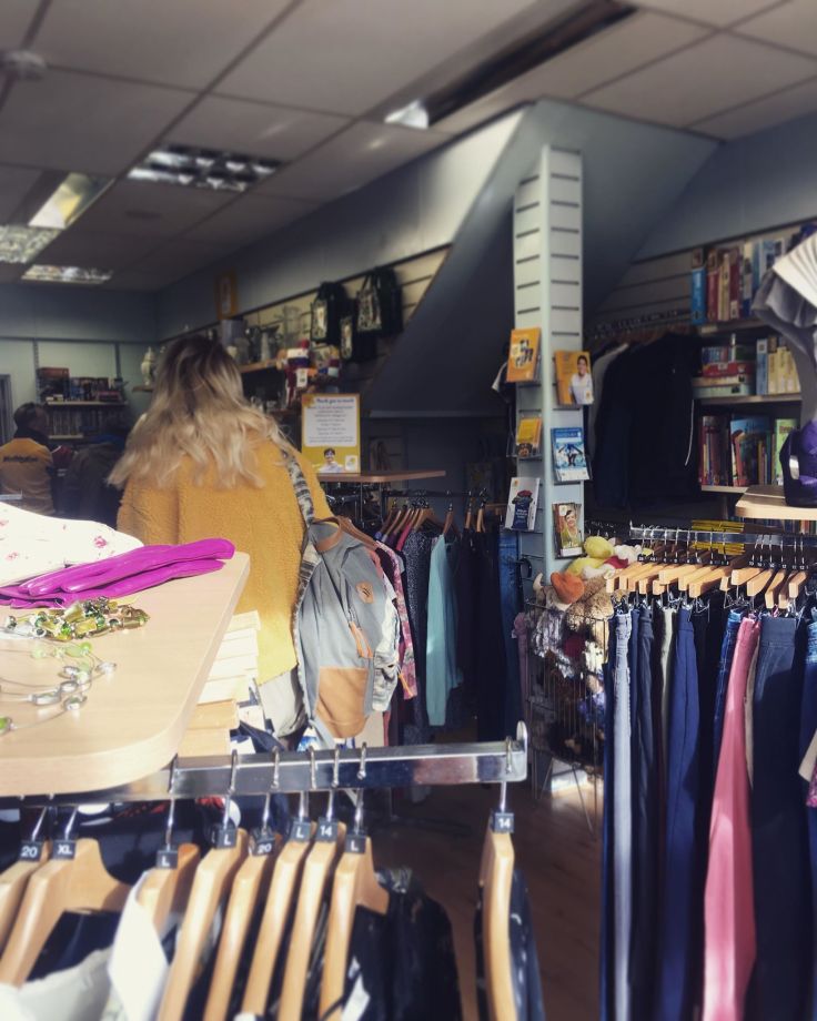
Today, Lydia and I went out in search for second hand fabrics. Altogether we went in about 6 different charity shops in Cardiff. As the brief is about sustainability it was important that I didn’t buy fabric brand new. I knew that I wanted to find mainly blue colours and a delicate see through fabric. Other than that I was quite open to what I may find. I came across a few sheets and some net curtains that I felt would be perfect for my shirt.
Before I could do the screen printing I had to make the flower design black and white with a very high contrast. I printed it out on normal paper which was then transformed the design into a sort of stencil. This meant that I could reuse the design as many times as I wanted. Now that my design had been transferred onto the mesh screen I placed it on my fabric and chose the colour paint that I wanted. Using a squeegee I could apply the print to the material.
