BA Hons Fashion Design (Year 3)
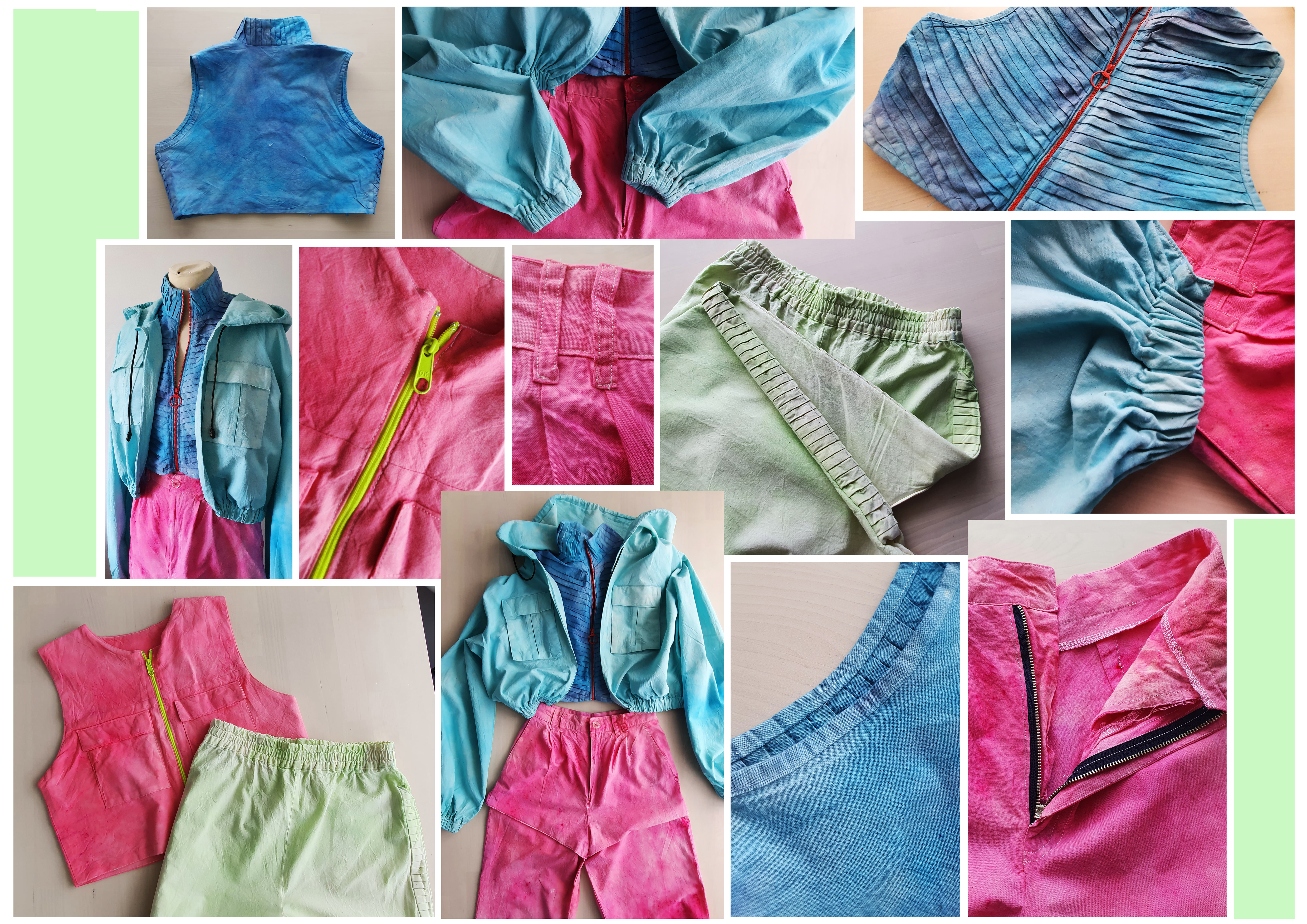
I decided to take my final pieces a step further, as I couldn’t make it out of the real fabric I used dye to apply colour to my toiles. For me, this made the outfit truly come to life. It was hard to picture it before I dyed them, and I was slightly unsure if the colours would actually match but I think they go together really well!


The results of my photoshoot were a lot better than I expected. The projections gave me a better idea of what works well and some of the abstract prints looked amazing applied to fabric which has given me so many ideas for future designs. My favourite was the jacket on the bottom left-hand side, the image was of a 1970s living room and the two triangular tables have appeared on the shoulder, which actually works really well and looks sporty.
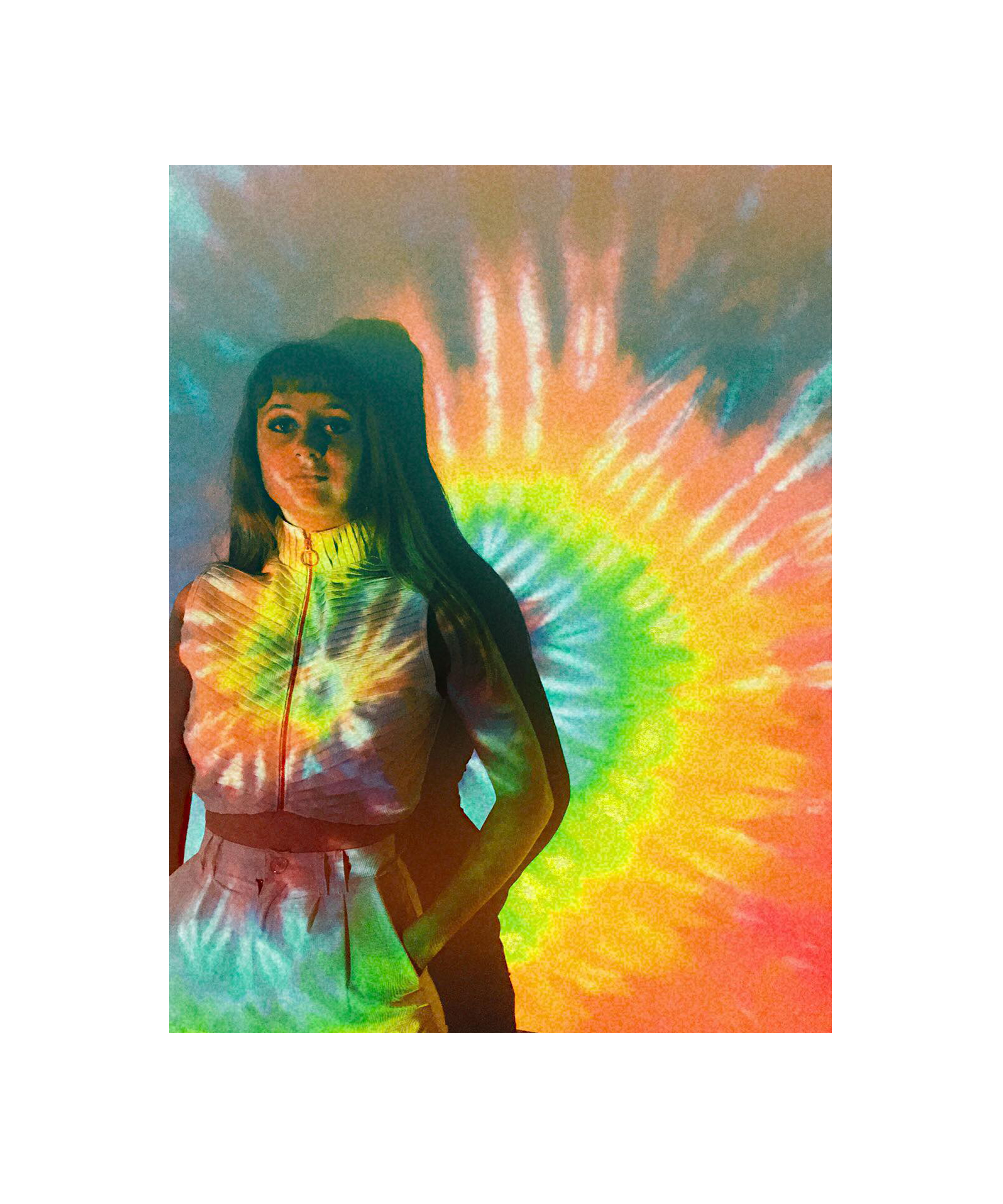


I really enjoyed doing the photoshoot as it gave me so many print ideas for the future. I like how experimental it was. I had all of my favourite psychedelic and 1970s images on a loop through the projector. This perfectly shows the abstract patterns I was trying to achieve with the dye.
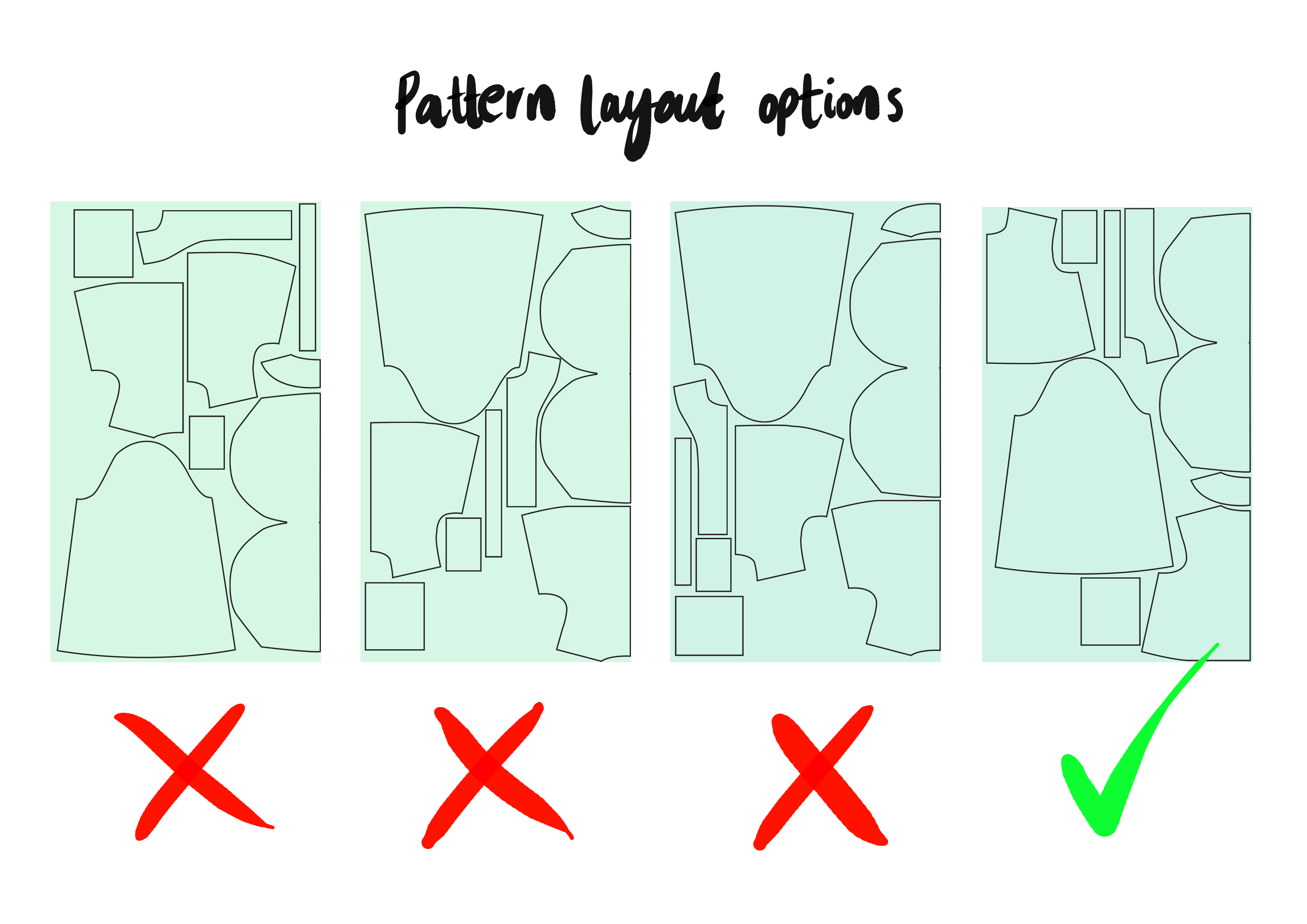
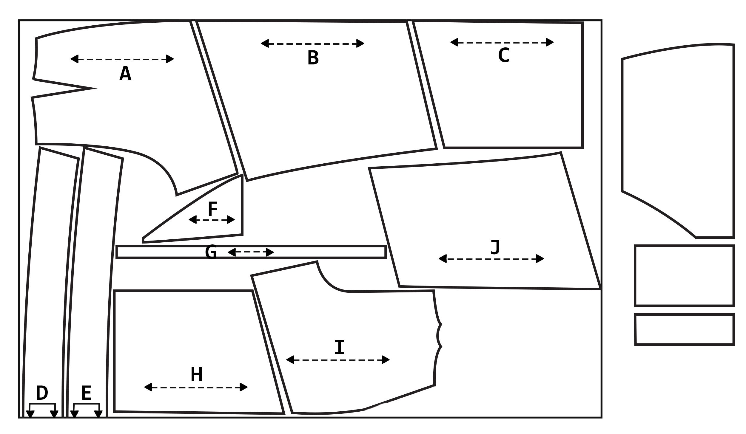
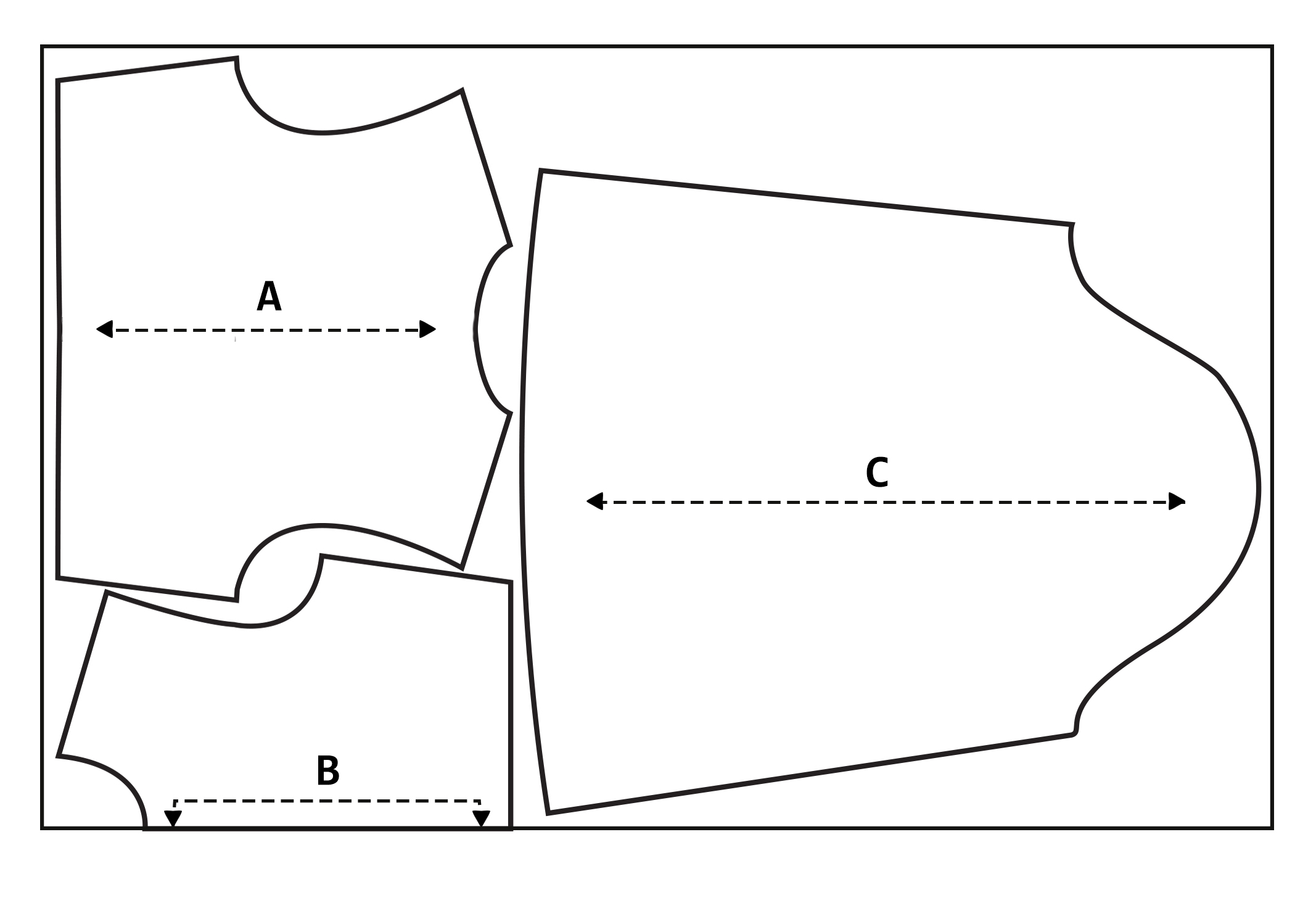
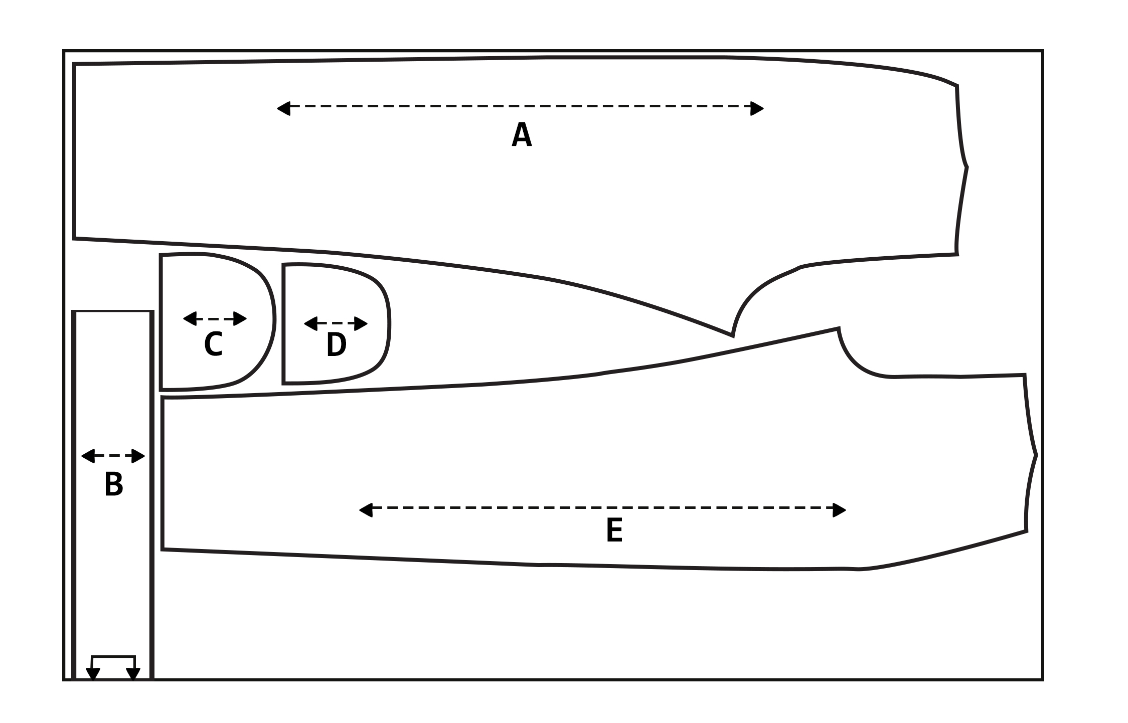
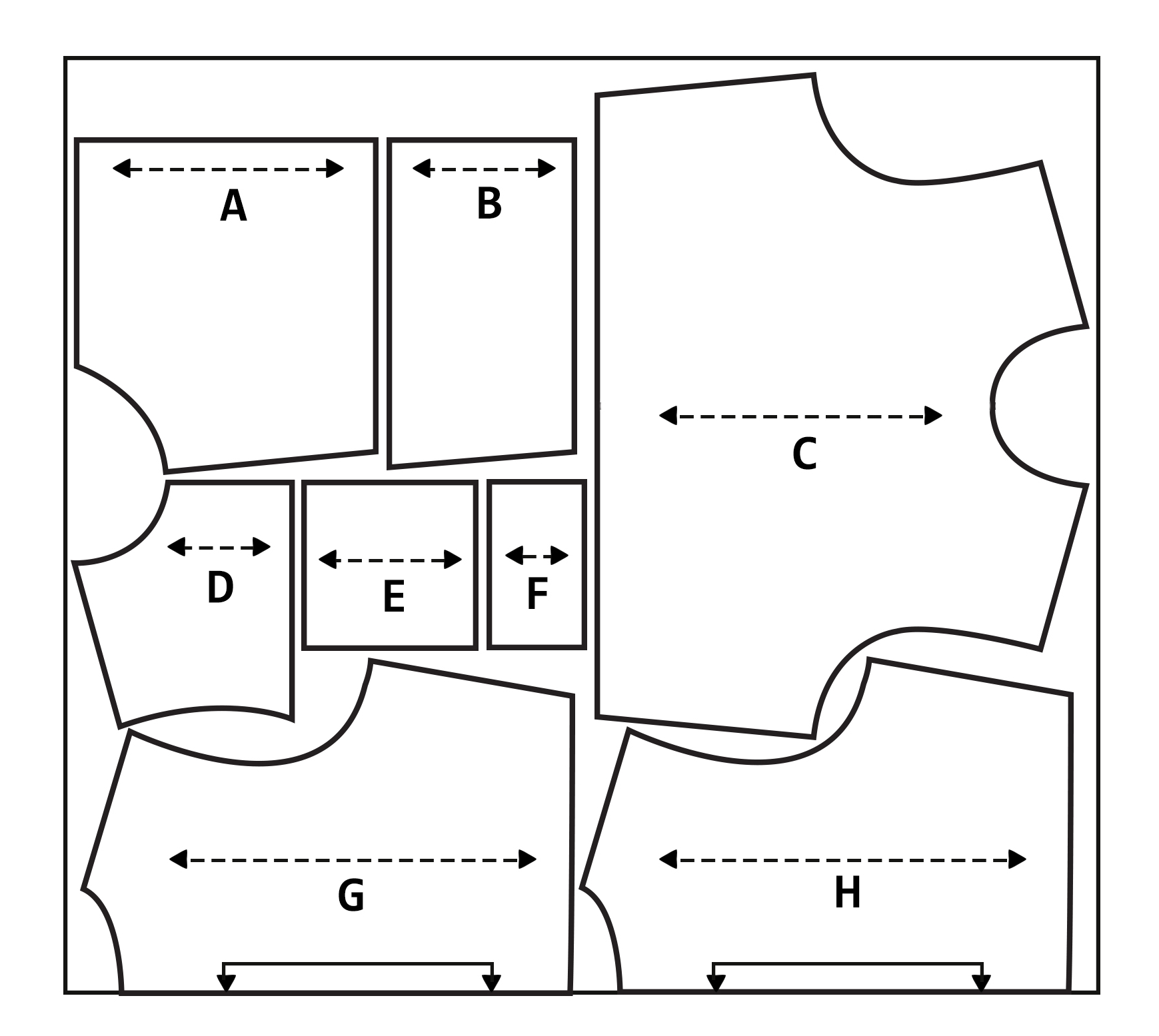
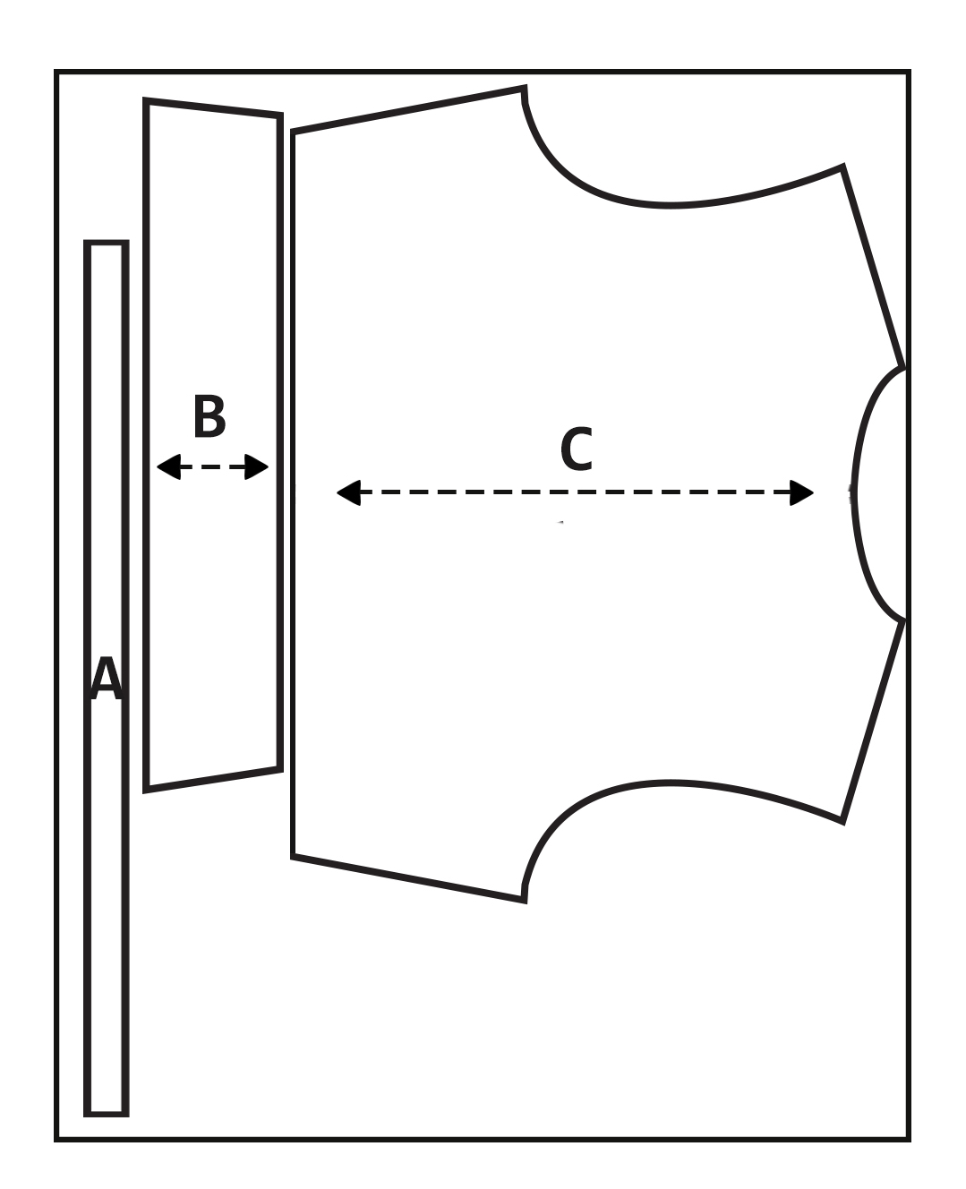
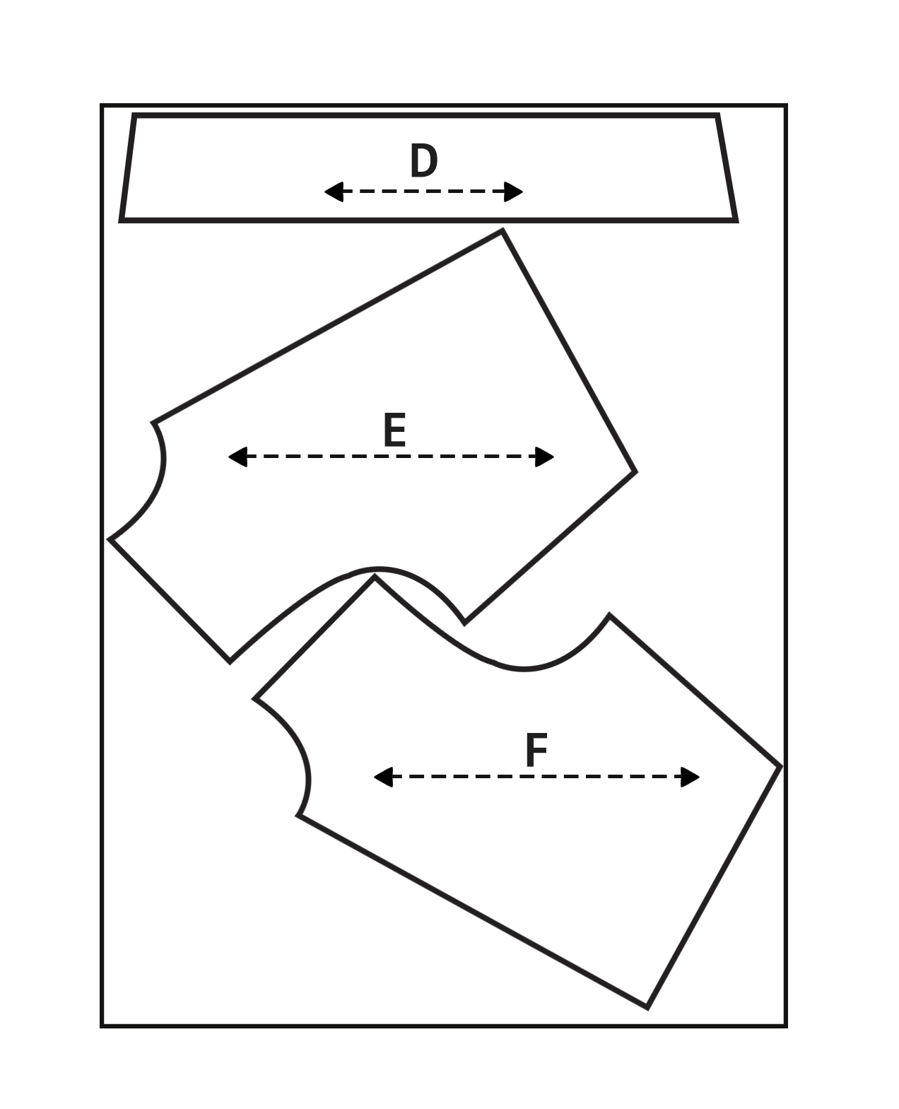
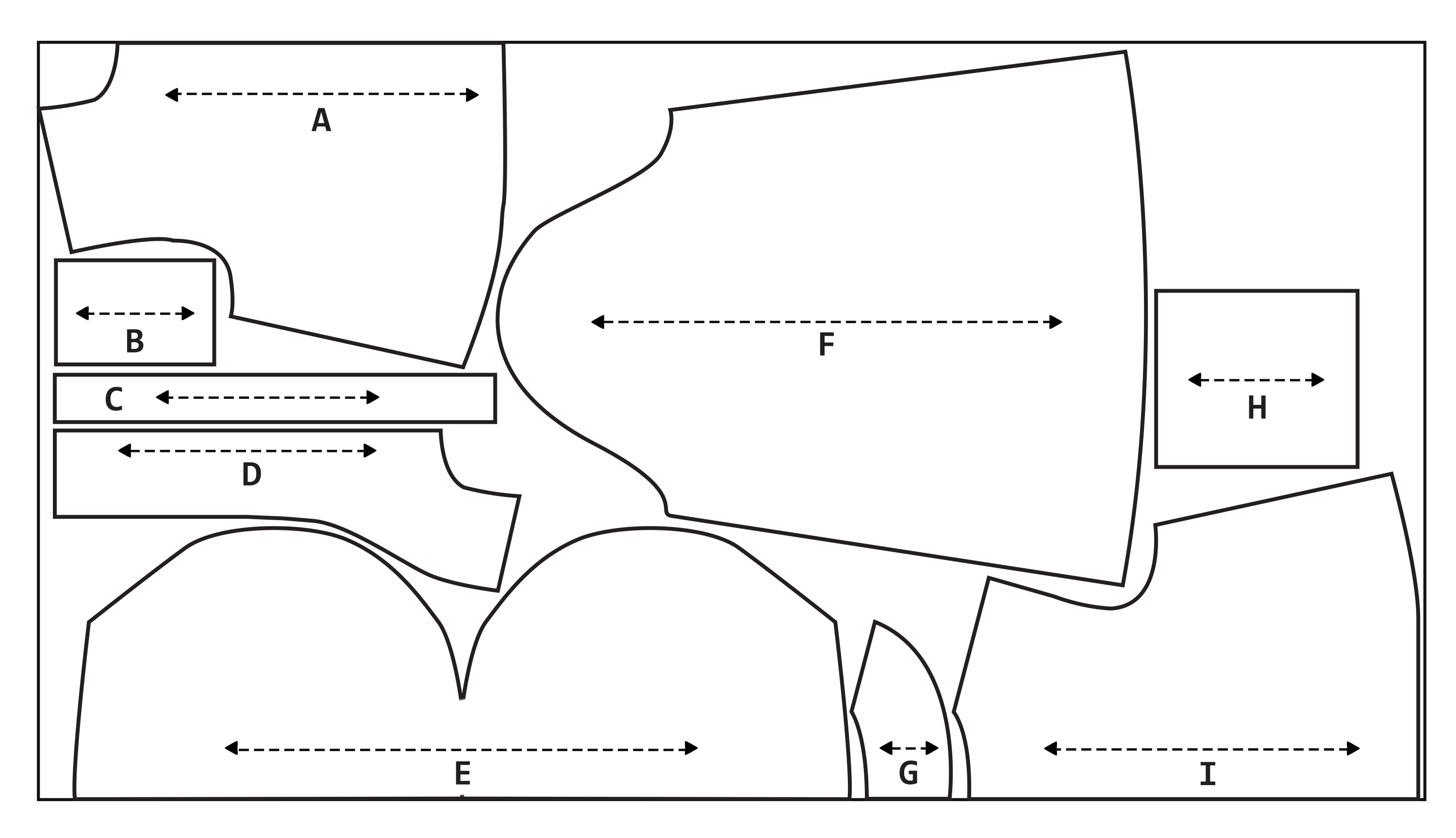
I thought carefully about my pattern layout options. Although there doesn’t look like there’s much difference between each of these, I managed to make the final one just a couple of centimetres shorter than the rest. This may not sound like a lot but if I was to mass produce this every millimetre would count; waste is such a big problem in the fashion industry so I have to be mindful of it.


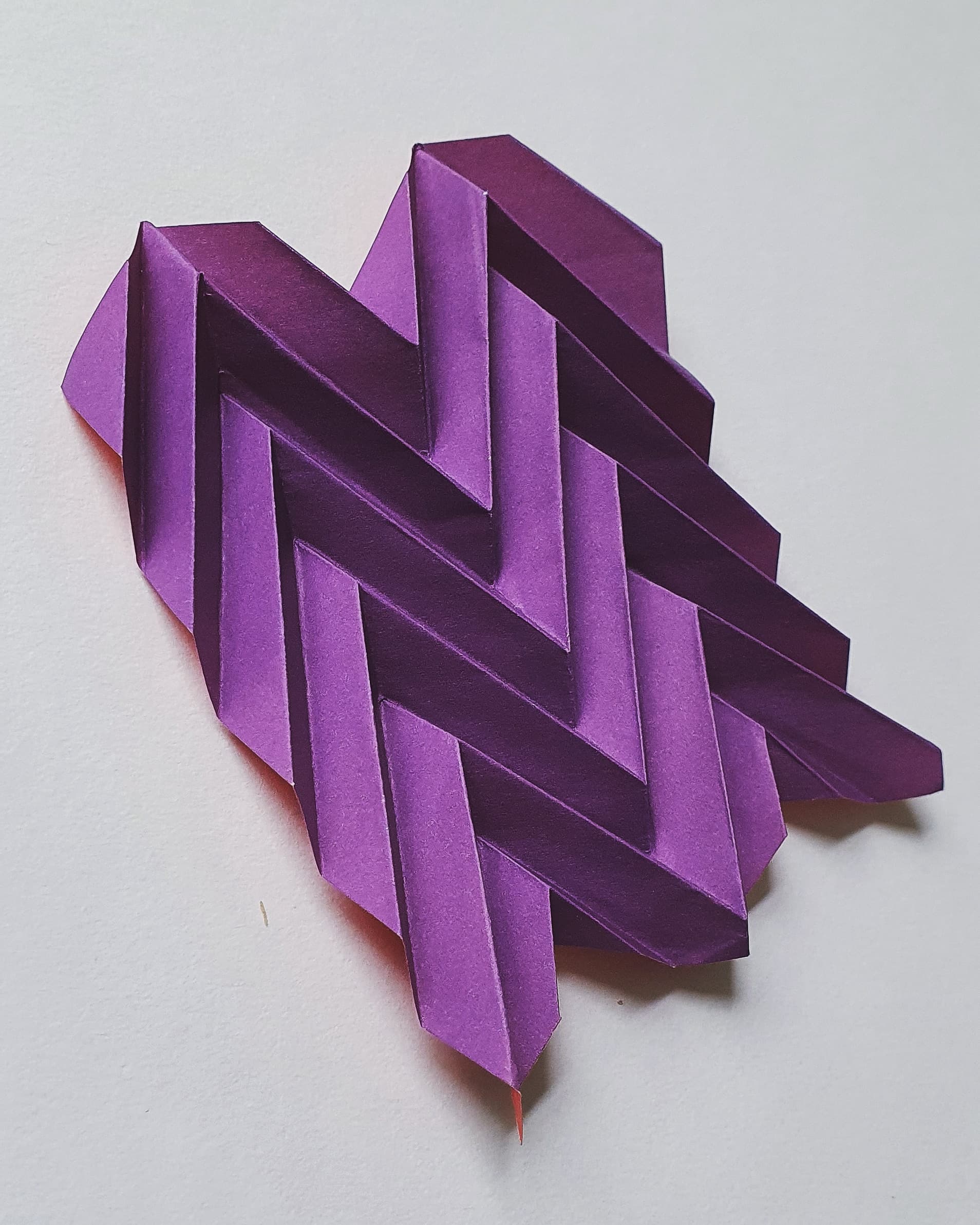
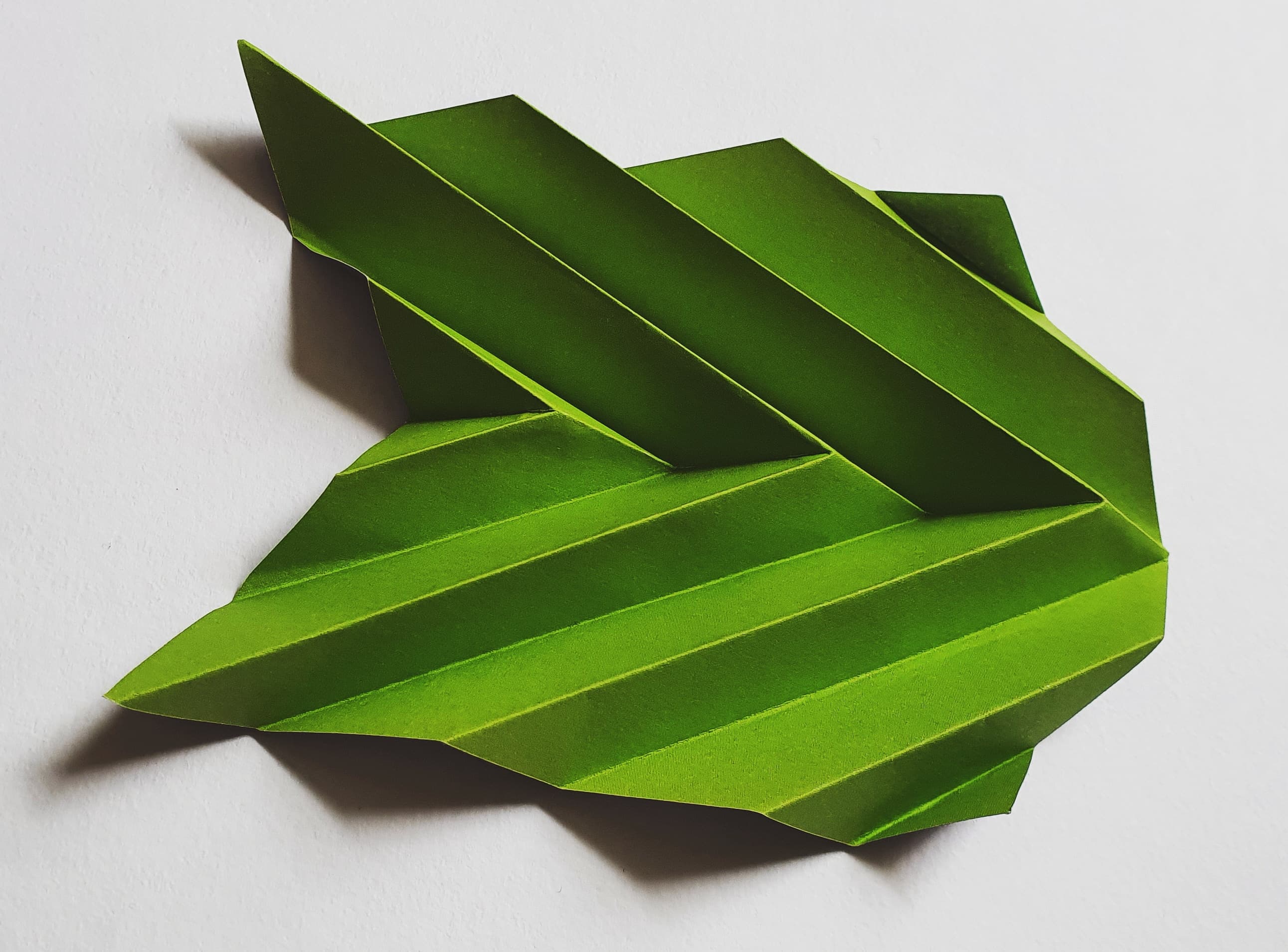
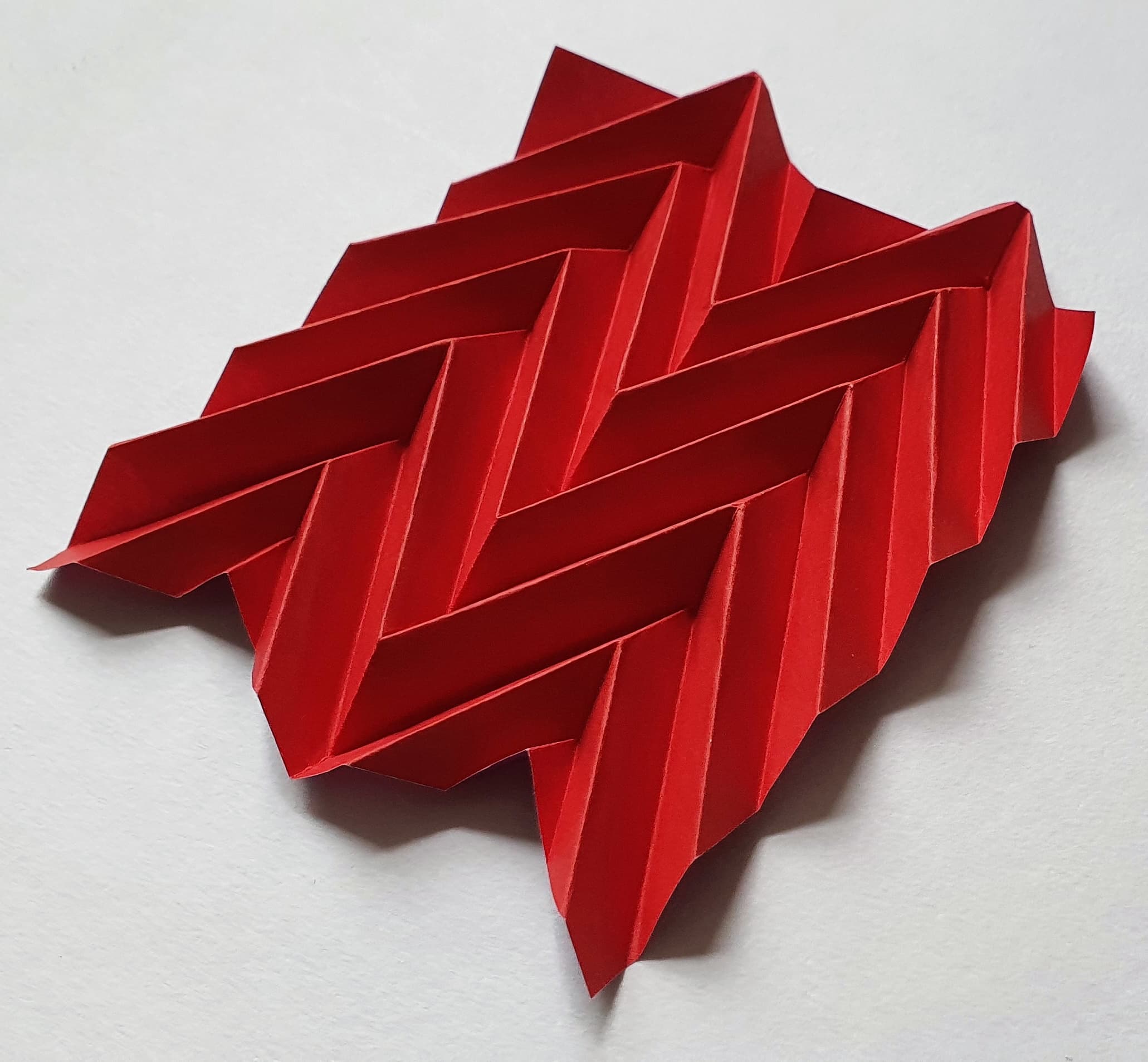
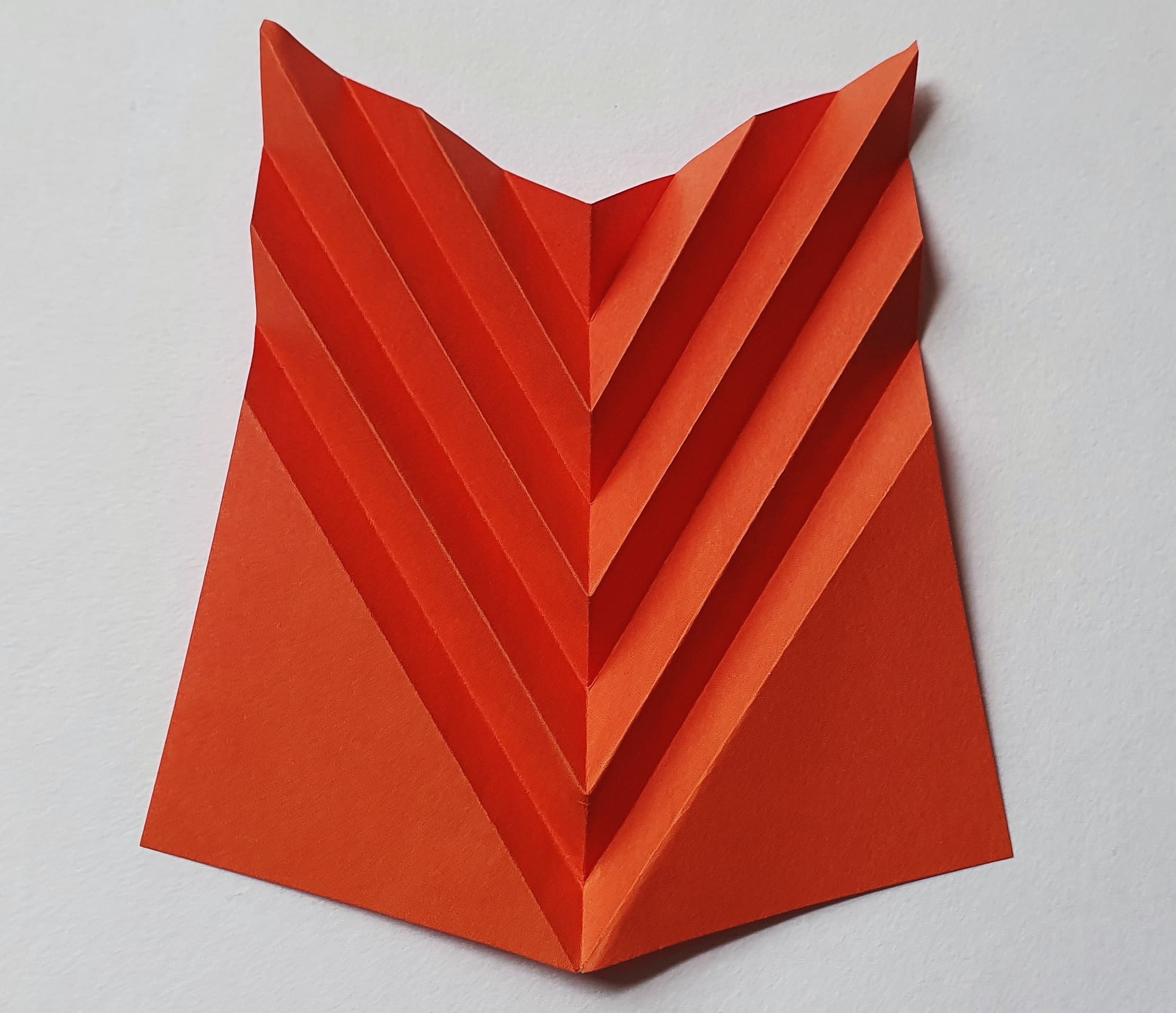
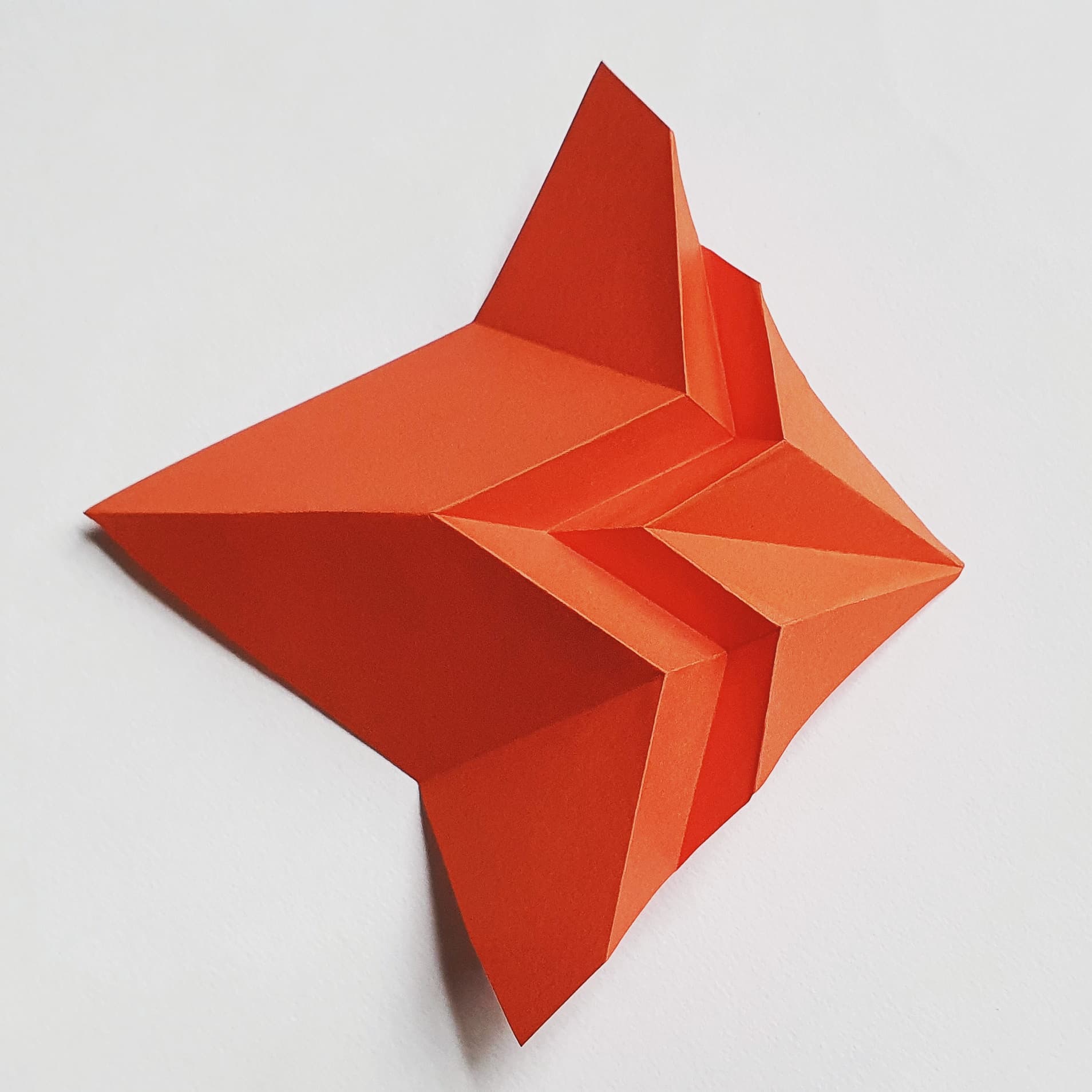
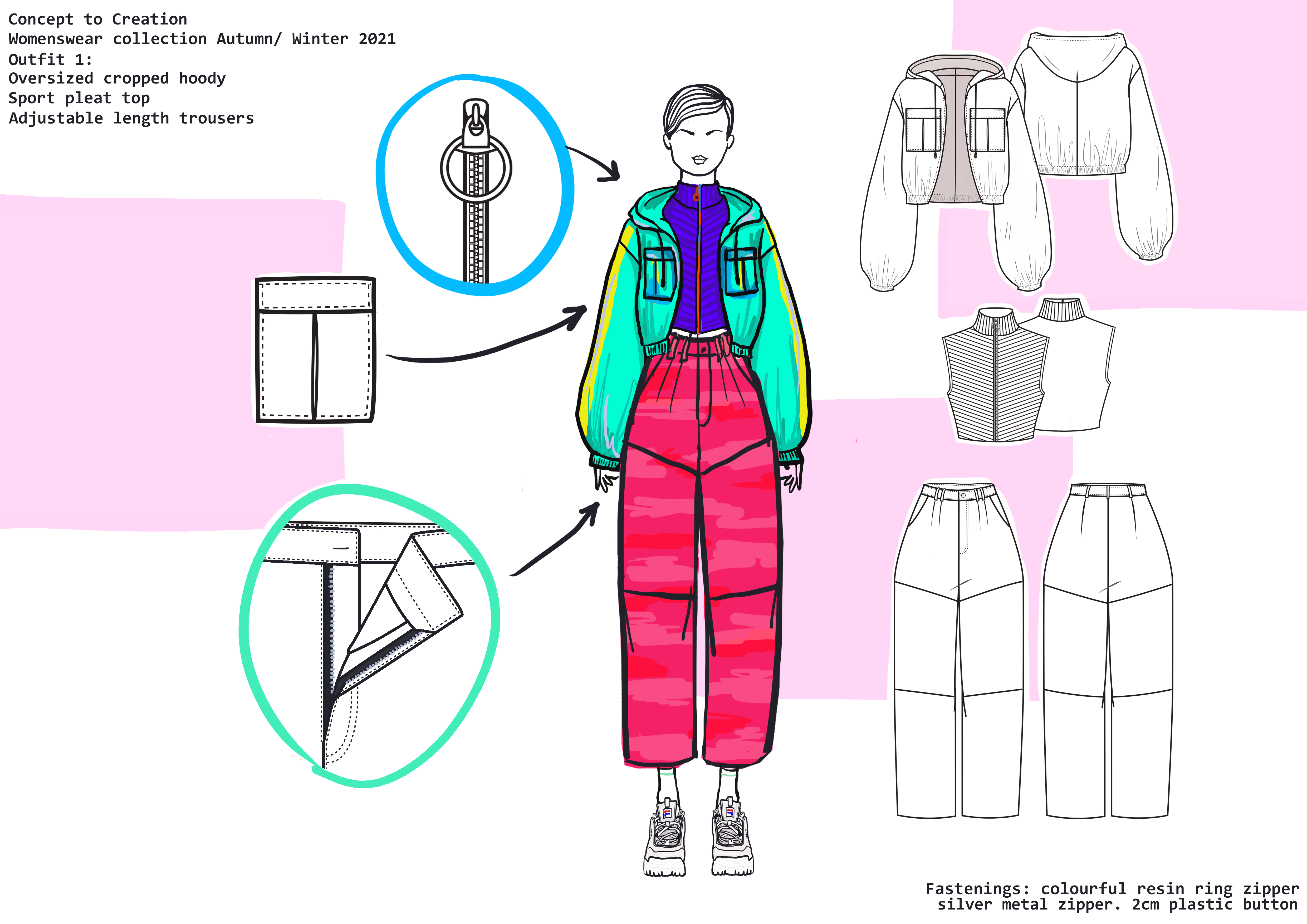
I chose this style of zip as I wanted it to stand out above everything else as it’s in the center and I didn’t want it to be overpowered by the pleats. The circle goes well with my theme of circles and shapes. The zip was quite difficult to sew in place as the pleats moved around so much.