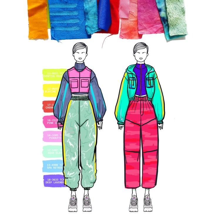
For the hoodie I made elasticated . This was used to bring the enlarged jacket inwards along the bottom and on the wrists. I originally planned on using a stretchy ribbed fabric but I feel as though the elastic wrapped in fabric worked a lot better. The way I did it is a bit more unique and is more of a obvious feature in my design. I achieved this look by folding a small gap just slightly wider than the piece of elastic. I then sewed around the edge and threaded the elastic through a small gap and sewed up the hole. With the hood, I threaded some rope through the hole to create an adjustable tie. I finished these off with a toggle/special knot.
FINAL LOOKS

I believe my two final looks compliment each other and work well as a mini collection. There is an obvious theme of colour, tie-dye, shape, winter, sport that bind the two together.
COLOUR VARIATIONS

I used my tie-dye samples to create texture on my designs. I altered the colour on photoshop to see what looked best. My favourites were the brighter combinations. I like the idea of using dye for more of an abstract effect, like larger areas.
TOILE DEVELOPMENT

I focused a lot on creating shapes by folding when it came to developing my ideas on the mannequin. I ironed some pleats and used them to add texture, I love the way the light hits the folds and how the pleats can adapt and bend to fit all the different parts of the bodice. I brought in strips of yellow fabric to apply a sporty feel but this didn’t work as well as I had hoped.
INITIAL IDEAS

As a starting point I used the Polaroid I had taken of a 1970s lamp. I focused on the silhouette and developed the key shapes into elements of clothing. The most important thing I took from this was to design enlarged sleeves with a lot of fabric and gathers to create exaggerated shapes.
STORYBOARD DEVELOPMENT


Throughout this process I changed my ideas a few times; at first I planned to focus on print and geometric shapes, but due to Covid19 I had to adapt my ideas to fit the current situation as I was unable to access the facilities at University. And therefore, unable to develop my prints as much as I hoped I would. A large portion of my focus was on colour, so in the final moodboard I placed the colour scheme with Pantone references directly through the middle to put emphasis on it. I still derived key shapes from 1970s interiors but I combined it with more abstract patterns that I could achieve with fabric dye and do myself at home. I also developed this abstract idea into silhouettes and the physical shapes of garments, rather than just 2D, whilst in-keeping with my sportswear theme. The folded paper was my origami inspiration; rather than it being folded pieces of paper into animals and flowers, etc. I went for a more simple, geometric approach, focusing on the shadows and sharp edges that the creases and folds create. You could even say pleats are a form of origami as it is about folding.
COLOURED FABRICS

If I was to dye fabric again I would experiment with natural dyes to make it more environmentally friendly and sustainable. I don’t think I’d be able to achieve the same effects and the colours would probably be a bit lighter but it could have some really interesting effects.
TIE-DYE EXPERIMENTS
I chose to do tie-dye as the results are a lot more abstract than the painting and screen printing. I also like that it’s very unpredictable and you don’t know what you’ve created until 8 hours later and you’ve rinsed the fabric off. it also adds texture to my outfits. I plan to include these patterns in my designs as I think they’ll add an interesting texture. I think tie-dye suits my 1960s/70s retro theme well, as heavily patterned fabric and tie-dye was very popular around this time.