CONCLUSION
I am quite happy with how my comic turned out and I have really enjoyed learning about comics. Before this project I had very little knowledge of comics and hadn’t read one since I was a lot younger. Even though I didn’t complete my comic what I did produce was better than I had imagined.
Luckily, I had what felt like a bit of a head start as in my last project I created a graphic novel. This taught me what not to do, therefore, this time around I had a better idea of what I was doing. As it was very new to me the end result of my graphic novel was that the story was quite unclear so my main aim this time was to make sure I didn’t repeat my mistakes and I feel as though I accomplished that.
I started out by going to the museum to get some inspiration. I found one of the images particularly striking; an abstract oil painting by Laszlo Moholy-Nagy. The main thing I took from the painting was the different patterns that made up larger shapes, I wanted to take this idea and create different textures to add detail to my designs. I also went to the library and ended up loving the 1930s style comics with the grainy texture and retro block fills that didn’t quite line up with the outline. Even though probably done accidentally I liked the offbeat handmade effect it gave.
I struggled most with coming up with an idea for a story. I wanted to do something very different to my last project. My previous story was quite serious and after seeing James’ comics I was inspired to do something more entertaining and creative. Because of this I feel as though I enjoyed it more.
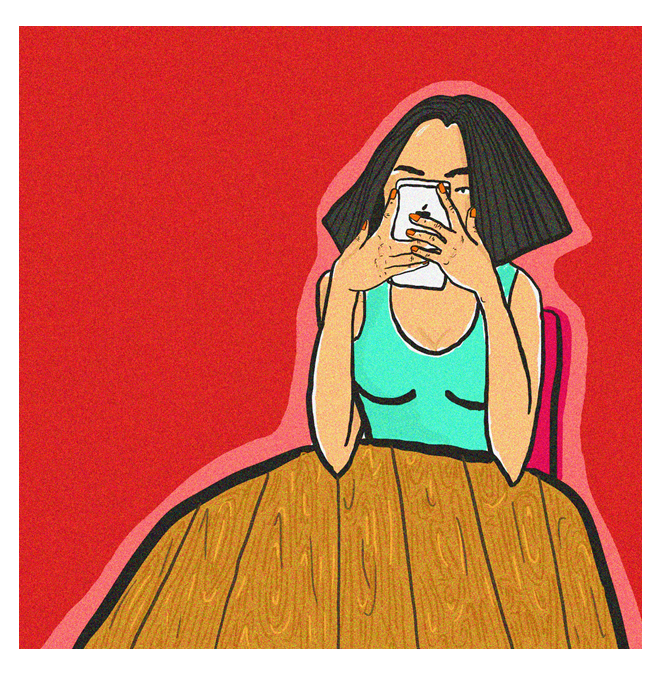
I tried to relate it something I know. My inspiration came from something I have strong feelings about, but I tried to portray it in a way that was funny and creative. The idea behind my comic is based around my own experience working in a restaurant and seeing firsthand the lack of interaction with people because they’re always on their phones. I tried to make my comic quite humorous whilst shining a light on the problem. I used the spider phone that attaches itself to your face as a sort of metaphor for being glued to your phone/ it having hold of you and not being able to escape it and portraying it as a sort of disease that is spreading. I also used patterns and crazy eyes to portray people going crazy when they don’t have their phones.
During this project I experimented quite a lot with styles and mixed media. I wanted to mix hand drawn and digital work together but combining the two didn’t work as well as I’d hoped. I originally tried drawing by hand but found this a lot more time consuming and as I’m a perfectionist I found illustrator a lot easier to rectify my mistakes and edit things layer by layer. I also found I could create the same effects using photoshop and in my opinion, this looked a lot neater. I did end up changing my character style halfway through as I started to dislike the way it looked. Although, I’m glad I did it as I am now much happier with the outcomes. But this did set me back a bit.
As I study fashion, I am new to the storytelling and still working on my drawing using photoshop. But this 5-week project has given me a lot more confidence in my drawing skills and I have seen a vast improvement in my own work since my last project. I now feel a lot more confident and ready to use this in my subject more when designing clothes. I also think it would be good to bring the story telling aspect into my fashion to give my work a deeper meaning.
If I was to do this project again I would make my comic a bit shorter and squeeze more into the frames.


In this piece I printed out the phone separately. I used tape underneath to make this part stand out to emphasise the importance and what I want the viewer to focus on. I chose to reveal that the female character is playing tetris on her phone to show what she’s doing instead of having any interaction with her partner. You can see by their body language that it’s causing them to break apart and he’s not happy about it but she’s oblivious. I plan on making my male character anti-iPhone/ technology and he expresses it through his silent and angry facial expressions.
SMALL DETAILS


I added detailing to things like the hair and the wood on the bench to add texture so the drawing wouldn’t be so flat. I hope this means that my individual images look more striking and more interesting to look at.


Again I used the risen effect to highlight the important parts of the image and what I want the viewer to focus on for a specific reason. The point of this frame was to show that she’s outdoors sat on a bench listening to music whilst the birds sing. She has her eyes closed and headphones in completely ignoring the beautiful outside world and her partner.
CHARACTER DEVELOPMENT


Originally, I designed my character to have shorter arms and rounder features but the realistic version was a massive improvement. I started to realise that although I had put more work into the first version and it had more detailing it wasn’t necessarily more interesting. I decided to make it more vibrant and futuristic by incorporating simple thick lines and geometric shapes. I focused on clothing to create something that looked cool and unique with highlights to reveal the shine. I think it also looks more comic like because of the bright colours.
The phone stuck to the face is a metaphor for literally being glued to your phone/ it having a hold on you/not being able to get away from it.
SPIRAL EYES
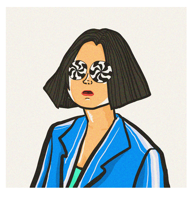 I’m unsure if I prefer this version of my drawing or the one surrounded in colour. I feel as if the colourful image may be too garish and takes away from the main focus of the image; the eyes. I put the grain effect on top of all of my pieces as I felt this added texture and made the image less flat.
EXPERIMENT


This image from my comic is the part where the phone has been pulled away from her face and has sent her in a sort of confused/dazed state. I made her eyes spirally and surrounded her in colours to try and portray this. I wanted to add some depth to the image to exaggerate the dazed effect and make it more interesting. I cut out each colour and layered them up but this wasn’t as effective as I’d hoped as when I photographed it from above it wasn’t obvious. I may just use the original in my final piece.


