I am quite happy with how my comic turned out and I have really enjoyed learning about comics. Before this project I had very little knowledge of comics and hadn’t read one since I was a lot younger. Even though I didn’t complete my comic what I did produce was better than I had imagined.
Luckily, I had what felt like a bit of a head start as in my last project I created a graphic novel. This taught me what not to do, therefore, this time around I had a better idea of what I was doing. As it was very new to me the end result of my graphic novel was that the story was quite unclear so my main aim this time was to make sure I didn’t repeat my mistakes and I feel as though I accomplished that.
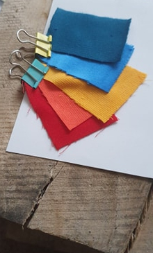
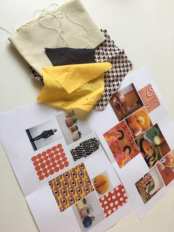
I started out by going to the museum to get some inspiration. I found one of the images particularly striking; an abstract oil painting by Laszlo Moholy-Nagy. The main thing I took from the painting was the different patterns that made up larger shapes, I wanted to take this idea and create different textures to add detail to my designs. I also went to the library and ended up loving the 1930s style comics with the grainy texture and retro block fills that didn’t quite line up with the outline. Even though probably done accidentally I liked the offbeat handmade effect it gave.
I struggled most with coming up with an idea for a story. I wanted to do something very different to my last project. My previous story was quite serious and after seeing James’ comics I was inspired to do something more entertaining and creative. Because of this I feel as though I enjoyed it more.
I tried to relate it something I know. My inspiration came from something I have strong feelings about, but I tried to portray it in a way that was funny and creative. The idea behind my comic is based around my own experience working in a restaurant and seeing firsthand the lack of interaction with people because they’re always on their phones. I tried to make my comic quite humorous whilst shining a light on the problem. I used the spider phone that attaches itself to your face as a sort of metaphor for being glued to your phone/ it having hold of you and not being able to escape it and portraying it as a sort of disease that is spreading. I also used patterns and crazy eyes to portray people going crazy when they don’t have their phones.
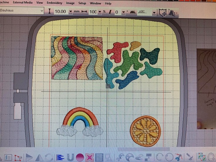
During this project I experimented quite a lot with styles and mixed media. I wanted to mix hand drawn and digital work together but combining the two didn’t work as well as I’d hoped. I originally tried drawing by hand but found this a lot more time consuming and as I’m a perfectionist I found illustrator a lot easier to rectify my mistakes and edit things layer by layer. I also found I could create the same effects using photoshop and in my opinion, this looked a lot neater. I did end up changing my character style halfway through as I started to dislike the way it looked. Although, I’m glad I did it as I am now much happier with the outcomes. But this did set me back a bit.
As I study fashion, I am new to the storytelling and still working on my drawing using photoshop. But this 5-week project has given me a lot more confidence in my drawing skills and I have seen a vast improvement in my own work since my last project. I now feel a lot more confident and ready to use this in my subject more when designing clothes. I also think it would be good to bring the story telling aspect into my fashion to give my work a deeper meaning.
If I was to do this project again I would make my comic a bit shorter and squeeze more into the frames.